Where in France are the most companies created? This question is essential to understand the dynamics at work in the various French counties.
Using INSEE data, we would like to offer you a simple answer. However, as is often the case, the data are full of surprises and getting a good (and attractive) result has required some effort on our part.
If you are interested in business intelligence and in particular the use of Tableau, you will find in this post the opportunity to learn how to make a quantile visualisation.
The origins of the data
Are you looking for quality data on French companies? Go to INSEE, of course. As always, there is nothing better than national statistical institutes to find data on a specific market.
INSEE offers you monthly data for the different types of companies: companies, micro-enterprises, individual companies. Best of all, the data are available over a very long period (since 2000).
However, be careful when analysing these data as micro-enterprises for instance only exist since 2009.
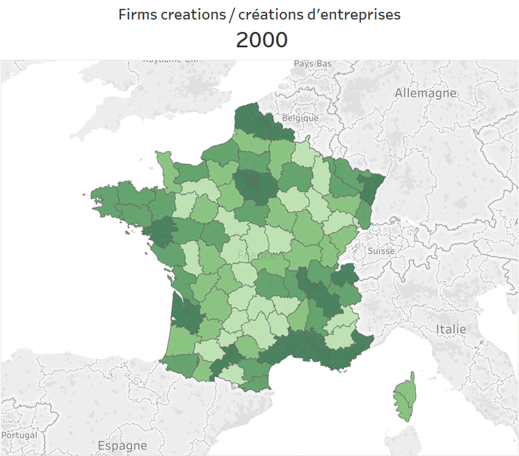
Geographic visualisation of data

Simply visualising territorial dynamics may seem easy, but as is often the case when disparities are significant, the result was disappointing. Indeed, using the colour gradient suggested by default in Tableau inevitably leads to a map where no significant differences appear. Since the Paris region accounts for a substantial proportion of new business creations, the other regions are necessarily at the bottom of the colour gradient and therefore do not differ from each other. The data-mining exercise would, therefore, be a failure if we stopped there.
We, therefore, had to resort to a trick to make the differences tangible and visible and to make the territorial and temporal dynamics make sense.
Quantile visualisation

The trick we used is based on a quantile visualisation (in this case by quartiles) that we had already successfully used in another data-mining exercise (visualisation of the shadow economy). The values of company creations are assigned in 4 classes (buckets): the lowest 25%, 25-50%, 50-75%, the highest 75%.
And immediately, the differences become more evident.
Some might argue that it would have been simpler to use a 4-inch colour gradient. And indeed some differences would have appeared more clearly. But as long as the intervals are evenly distributed, the vast differences continue to produce their effects and the result, visually, is disappointing. A quartile visualisation is therefore much more explicit and is our favourite.
Results
The results are as usual available in our Public Tableau space. For those who prefer to see the result directly without going through the Table, we have created a small gif animation. You will see that in the end, the ranking of counties changes little from one year to the next. The areas that are most or least conducive to business creation remain the same. Of course, population density necessarily plays a role in the number of companies created. It would be logical to expect that the most populated counties would also be the ones that create the most companies. The next exercise will, therefore, consist of analysing the rate of business start-ups per inhabitant and identifying the most dynamic counties.
Join us in our next post for the answer to this question.