Data Visualization, or DataViz, is the discipline that focuses on the graphical representation of raw data. The purpose of data visualization is to create value. The last few years have seen the emergence of new tools and practices around data visualization and new professions’ emergence. This article will start by giving you the definition of data visualization and illustrate with a concrete example of the 5 levels of data visualization. We will then cover the evolution of data visualization practices and review the different tools available. Finally, we will give you some practical consulting to get you started with DataViz.
I have tried to cover the essence of the subject and offer different perspectives. If you have any suggestions, please feel free to leave a comment. If you need DataViz consulting, feel free to contact me by email or via LinkedIn.
If you only have 30 seconds
- data visualization (or DataViz) aims to explore large amounts of data using a visual medium
- There are 5 levels in the data visualization (0 to 4) depending on the tools used and the objectives pursued
- data visualization is rooted in the need to make sense of excessive amounts of raw data
- Examples of very old visualizations are documented as early as the 16th century.
- 3 phases can be distinguished in the development of visualization tools
Summary
- Introduction
- Definition
- The 5 levels of data visualization: a concrete example
- Histoiry of data visualization
- Challenges and opportunities in business
- DataViz tools
- Practical advice
- Conclusion

Introduction
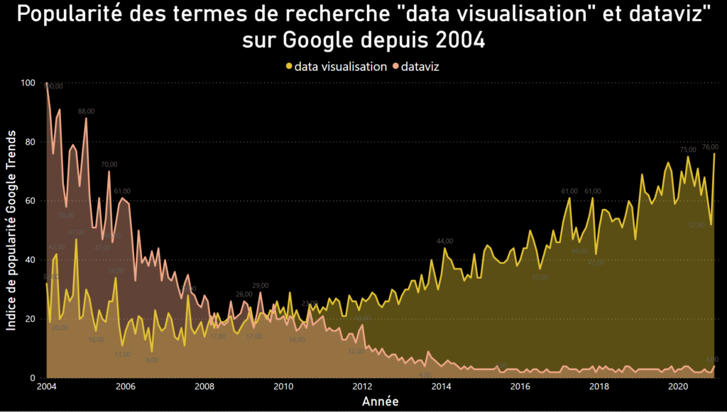
It will not have escaped you that data has become a significant issue for all companies. Data science has gone from a buzzword 5 years ago to a priority for many companies. This can be seen in the search terms on Google (see graph below). It is worth noting that the term “data visualization” seems to be widely preferred since 2010 to “DataViz.”
The demand for data scientists increased by 59% between 2018 and 2019. The Harvard Business Review made it the sexiest job of the 21st century in a 2012 article. However, it would be wrong to think that data visualization is a new practice. It has always been used to visually report the complexity of a problem or the evolution of a situation. As early as the 19th century, social scientists such as Charles Booth visualized the data, they collected to materialize their discoveries. Visualizing a problem has the positive side effect of simplifying understanding. Isn’t it said that a good picture is better than a long speech?
Data visualization: definition
What is data visualization? It is the practice of representing data in graphical form to simplify its understanding. I insist on the “simplifying comprehension” dimension because this is the interest of a good visualization compared to a table full of figures. The amount of data available to companies is increasing exponentially, reinforcing the importance of data visualization.
This constant increase has been theorized by IBM’s 4V rule (see graph below, credit IBM) and explains the emergence of ad hoc data visualization tools. The first tools for business purposes (Tableau, Qlik) appeared already more than 10 years ago. With them also appeared a new term: business intelligence (or BI for short). Every year, Gartner makes a complete benchmark of all the tools available on the market.

Data visualization: the 5 levels explained with a concrete example
An example is better than a long speech, so I thought a concrete case would enlighten you. I propose that you grasp the interest of data visualization by taking up a theme that I dealt with in 2020, that of migratory flows towards the European Union.
Level 0: raw data
Level 0 DataViz is, of course, no DataViz at all. In this example, you will find yourself with a file of a few thousand lines. The data is very granular, and a line is therefore created for each migrant segment. The database also has a lot of null values for empty segments. As an example, Estonia has not received any migrants over 18 years old from Afghanistan.
Level 1: Aggregated visualization in Excel
Level 1 data visualization is what you can achieve with a tool like Excel. A histogram, a pie chart, a curve, are already (simple) forms of data visualization, and it can already be enough. It is therefore not surprising that many companies use them and are satisfied with them. To continue the previous example, we find ourselves with a visualization of the evolution of the number of migrants per year. At this stage, the reader is therefore faced with a static visualization that presents a relatively low level of granularity. Exploring the data in greater depth would require multiplying graphs of this type to compare, for example, the evolution by country, by age group, by gender, and so on. As this information is different and the countries of origin and destination are numerous, it would be challenging to represent everything on a single graph.
Level 2: different types of data on a single graph
Disregarding simple graphical representations (histograms, pie charts, curves…) allows you to get to the essence of data visualization. Moving from level 1 to level 2 requires a certain amount of creativity and experience to create visual representations that give real insights. In my opinion, what differentiates the DataViz specialist from the Excel user is precisely that: the ability to create a visual representation that allows you to go beyond the most obvious conclusions. It is this same frontier that separates the world of BI from that of data science. Therefore, we can imagine that a level 2 visualization would mix origin, gender, and volume data. This is what I have quickly tried to do below.
Level 3: Interactive data visualization
The most powerful tools on the market allow you to create interactive visualizations. The user becomes the actor of his data-based discoveries. By activating filters and options, he has the opportunity to vary the visualization according to his needs. We thus move from a static visual representation to a dynamic one. The example below, which I put online on Tableau Public, allows the user to switch from one country to another, to observe the variations year after year for each gender. Additional insights are made available in the form of automatically updated rankings. I invite you to test this dynamic dashboard by yourself by visiting my Tableau Public page.

Level 4: Data Art or the ultimate level of data visualization

The last level of data visualization (which I try hard to approach with creations like this one) adds an aesthetic dimension to the whole. Data mining and insights discovery are no longer sufficient. The result still has to be attractive, worthy of being on the wall of your living room. The “data artist” profession is in vogue with artists such as Nicholas Rougeux (whom we have already received on our podcast) or the fantastic Federica Fragapane. In this category, the tools used are more in the graphic designer’s palette than the analyst. To learn more who being a data artist, check the interview of Nicholas Rougeux below.
A historical perspective on data visualization
")
If the practice of graphically reporting a problem is not new, the term “data visualization” is probably more so. By measuring this term’s popularity on Google, we can see that it is becoming more and more prominent from 2010 onwards (see graph above). Curiously, the name “DataViz” has become entirely anecdotal after having been at its peak in the early 2000s (a geographical analysis shows that the term “DataViz” now seems to be the prerogative of research conducted in France, the rest of the world has apparently given up using this term).
However, data visualization is not new. If I mentioned the example of Charles Booth in the 19th century in the introduction, it could be said that even more distant examples have come down to us. In their book “Cartographies of Time” (2012), Daniel Rosenberg and Anthony Grafton show how the representation of time has evolved through the ages. As early as the 16th century, embryos of visualization of temporal data began to emerge. The two examples opposite (Lorenz Codomann, Chronographia, 1596) and below (Johannes Temporarius, 1596) testify this.
")
In their own time and with the means at their disposal, each of the authors imagined a more visual way of reading and analyzing the data.
Some of the most sophisticated visualizations have their origin in quite old works. The Sankey graph is an evolution of flow charts, some of which are quite old. This is the case, for example, of the diagram established by Charles Minard in 1869 to represent Napoleon’s losses during the Russian campaign. It is typically a level 2 visualization (see my classification above) that mixes quantitative data (number of deaths) with topological and temporal data. The result is quite extraordinary and reveals the inventiveness of its author, characteristic of level 2 visualizations. This work is still being analyzed today and is even presented in the form of posters.
In 1869 Charles Minard made a visualization of the human losses during the Napoleonic campaign of 1812-1813 in Russia. This diagram, whose density is proportional to the human casualties, served as inspiration for many other visualizations. Sankey gave his name in 1898 to flow charts, which today are the origin of many fine data visualizations.
 par Charles Minard en 1869")
The increasing computerization of companies and the production of data following the digitalization of behaviors are the two elements that have contributed to the need for more data visualizations. Without this being absolute truth, I consider that the modern period can be divided into 3 phases:
The Excel phase: non-centralized data
The “Excel phase” corresponds to the period during which Excel was the unique tool used by companies to produce graphical representations used to illustrate reports. Although Excel is still widely used today, it is essential to remember that at one time, companies had nothing else for making graphs. A fundamental difference between today’s data visualization and pre-2000 data visualization is the intent behind the graph. Before 2000 the graph was produced with a reporting intention. The visualization was produced for reporting purposes. Questions from the recipient were handled asynchronously.
The ERP phase: the company’s essential data is centralized
At the turn of the 2000s, enterprise resource planning (ERP) software became popular and allowed companies to centralize their data. This is an essential step in connecting different business lines within the company. Various sources of data become connectable, revealing the need to analyze and interpret them. I see this move towards centralization as marking the rise of Business Intelligence (BI). ERP solution providers (SAP, Oracle) are seizing this opportunity and proposing integrated BI solutions that are still relevant today (see Gartner’s Magic Quadrant below). By extending their tentacles into all areas of the company, the amount of centralized data has only increased, reinforcing BI’s importance.
The development of DataViz stand-alone solutions
The increasing amount of data has led to the development of independent visualization solutions that are more powerful than those provided within software suites. Let’s first remember that Tableau (one of the first standalone solutions on the market as early as 2003) was born from a project to visualize large amounts of data. Pat Hanrahan and Chris Stolte developed VizQL (Visual Query Language), a language for graphically querying large databases. The need for autonomous visualization solutions are, therefore, the need to explore large amounts of data.

Data visualization: challenges and opportunities in companies
Although data visualization has acquired its nobility letters, and despite the democratization of tools such as PowerBI (Microsoft), Excel still has a bright future ahead of it. Many reporting tasks are always performed in Excel today. The equipment of the workstations can explain this omnipresence. Over the years, Excel has become a “universal language” that everyone can learn from their first steps with a computer.
It will not have escaped anyone’s notice that data-centric strategies have become very fashionable. Many companies claim to be “data-driven,” that is to say, basing their decisions on data analysis. Therefore, the opportunities offered by data visualization are intimately linked to the production of data in companies.
DataViz’s opportunities are naturally numerous and seem to me to stem from the challenges related to the data themselves. I want to distinguish three of them.
- The main challenge for companies today is (still) to move the practice of data visualization from reporting to data mining. Unleashing the power of data means using it to create value. All too often, however, visualizations are banal and content to report indicators day after day. Therefore, we could sum up by saying that companies are still far from having all adopted a data “culture.”
- The second challenge lies in the ability to make data visualization available to everyone. This is what Microsoft is trying to do by offering the PowerBI license. In doing so, each collaborator will be able to “play with the data” and search by himself for information that is likely to impact his work.
- The third challenge is more prosaically to collect and centralize data to allow their exploration. Data visualization only makes sense if it enables the exploration of quantities of data beyond what is possible with conventional office automation tools.
Data visualization: available tools
It would be difficult to pretend to make an exhaustive inventory of all DataViz solutions because I don’t know them all, and secondly, because others are already doing it.
So, I’m going to start by talking about the Gartner Magic Quadrant (below). This benchmarking tool is published once a year and evaluates different IT solutions, including data visualization solutions. The benchmark is divided into 4 categories:
- leaders
- challengers
- visionaries
- niche players
The 4 companies that dominate this benchmark are:
- Microsoft with PowerBI
- Tableau
- Qlik
- ThoughtSpot

PowerBI
PowerBI is Microsoft’s solution. It is proposed free of charge to purchasers of an Office 365 license. This is an ingenious strategy on the part of Microsoft, which intends to make PowerBI a “universal language” within the company in the same way as Excel (see above). The ease of use of PowerBI is quite alarming, especially when it comes to the most complex visualizations. PowerBI proposes a library (crowdsourced) of visualization models that are opportunities to break the routine of histograms and other pie charts. One of the disadvantages of PowerBI (which horrifies me) is the impossibility of exporting dashboards as png or jpeg files.
Tableau
Tableau has lost ground compared to PowerBI but remains, in my opinion, the most advanced solution on the market, the most complete solution also in terms of the latitude offered to the user. However, this latitude comes at the price of greater complexity, especially for the implementation of complex visualizations (Sankey diagrams, JoyPlot, …). Where PowerBI offers you a turnkey solution, Tableau forces you to take the side paths. In my opinion, Tableau’s functionalities remain more advanced than those of PowerBI, especially in the production of dashboards that are out of the ordinary (Levels 3 and 4 of the classification). Very early on, Tableau wanted to create a community of evangelists that it federates through 2 vehicles: Tableau Public, which allows you to use Tableau free of charge as long as you make the visualizations produced available to everyone; the IronViz, a data visualization contest that sees several hundred programmers (including me) compete every year. In 2020 Tableau has opened a virtual gallery that gathers the most attractive visualizations produced in recent years (data Art).
Practical advice to get you started with data visualization
If I had to give you some golden advice, it would be never to make graphs in Excel again and use a professional DataViz tool (whether PowerBI or another one). If you are a student, remember that many data visualization software can be used for free.
Why advise you to stop making graphs in Excel?
The underlying logic for producing a graph is quite different between Excel and data visualization software. This leads to having to “rotate” the data. Moreover, I have the weakness to believe that by starting as soon as possible to visualize data in an ad hoc solution, you will master it better and make a difference with your colleagues. The world of work is a jungle; you might as well be the king of the jungle. I introduced my son to DataViz, and he recounts his experiences in his YouTube videos (see below).
Is it necessary to take a DataViz course?
To get the basics, I honestly believe that it is not necessary to take a course. Also, every solution has forums and tutorials useful for “getting your foot in the door.” On the other hand, moving from one level to another (especially the transition from level 2 to level 3) requires, in my opinion, some coaching. It seems that it is quite complicated to move from one level to the next without a mentor or at least a trainer who can quickly guide you to the best paths to take. When faced with complicated situations, I find it useful to rely on someone who saves time by pointing you in the right direction.
How to progress by yourself?
My experience shows me that it is difficult to progress alone without real motivation. In my case, I reached a level of competence by participating in IronViz in 2020. The extensive research I had to conduct and the solutions I had to develop helped me greatly. Even if I didn’t win, I came out of this experience significantly impacted, as I have explained in this blog post.

Conclusions
Today, data visualization has become a skill in its own right in companies, even a profession for those most “data-driven.” The rise in power of specialized software, and Microsoft’s move to PowerBI, give us hope that new practices are emerging within companies. It is reasonable to think that Excel, as a visualization tool, is doomed. But before making data visualization an engine of digital transformation, we will have to wait many more years. Indeed, DataViz only makes sense if data is available and if a “culture of insight” develops, even among SMEs.
Posted in big data.
20 January 2022
Thank you for this good article. Most important is the highlighting of the need in the market to transform Power BI visuals to png or jpeg files.
20 January 2022
I can’t agree more. One of the annoying feature of Power BI is the absence of export possibility like in Tableau.