In light of our recent post on credit card ownership, we used once again Tableau to explore data related this time to analyse and visualize the shadow economy. The shadow economy is the part of the economy that runs “off the records”. From a fiscal viewpoint the shadow economy can be defined as all the activities that evade taxation; in other words all activities for which taxes should be paid and aren’t. Assessing the level of shadow economy is important when you plan to sell abroad. In your market research you should indeed assess the difficulty to sell in a new country and the level of shadow economy is certainly something to look at.
For this exercise we re-used the quantile visualization proposed on this blog in the hope that it will give some more interesting result than last time. Fortunately the quantile analysis revealed some interesting insights.
Sourcing the data
We assembled data from different sources to build a comprehensive data set on a large time period and many countries.
First we looked for data on the shadow economy in European countries. The work of Tudose and Clipa (2016) provided an excellent source of structured data.
Next we looked for data at a more global level. The International Monetary Fund (IMF) had an interesting publication available.
Tips for your market research
When looking for data for your market research, don’t forget to browse multiple sources of information to build the dataset you need. It’s quite unlikely that you’ll find online the very dataset you need. You’ll most probably need to build it by yourself. In that case pay attention to the homogeneity of the data and make sure that the data you assemble covers exactly the same scope.
If you look at our previous example on credit card ownership, you’ll see that the statistics covered European citizens aged 15 or more. If you want to extend the scope and go beyond European borders, you must therefore ensure that the data you collect also regards 15+ citizens. It’s quite obvious but it doesn’t hurt to repeat it, does it?
Visualizing the data
The data visualization part was pretty straightforward. We used a color gradient to display the percentage of shadow economy per country and broke down the data per year (from 1991 until 2015).
The only really interesting part of the Tableau dashboard was the visualization per quantile (see this tutorial for more info).
Interpreting the data
Interpreting the data is also pretty straightforward. The interesting part of the data analysis comes from the comparison between the visualization by percentage and the visualization by quantile.

The situation of the shadow economy in 1991
In 1991 everything seems pretty much aligned. Least virtuous countries are clearly visible on both maps. Central African and south American countries as well as Soviet Union clearly appear as the worst countries in terms of shadow economy.
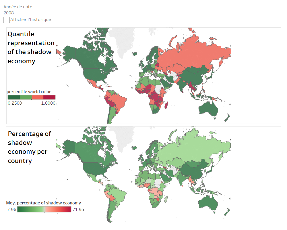
The situation of the shadow economy in 2008
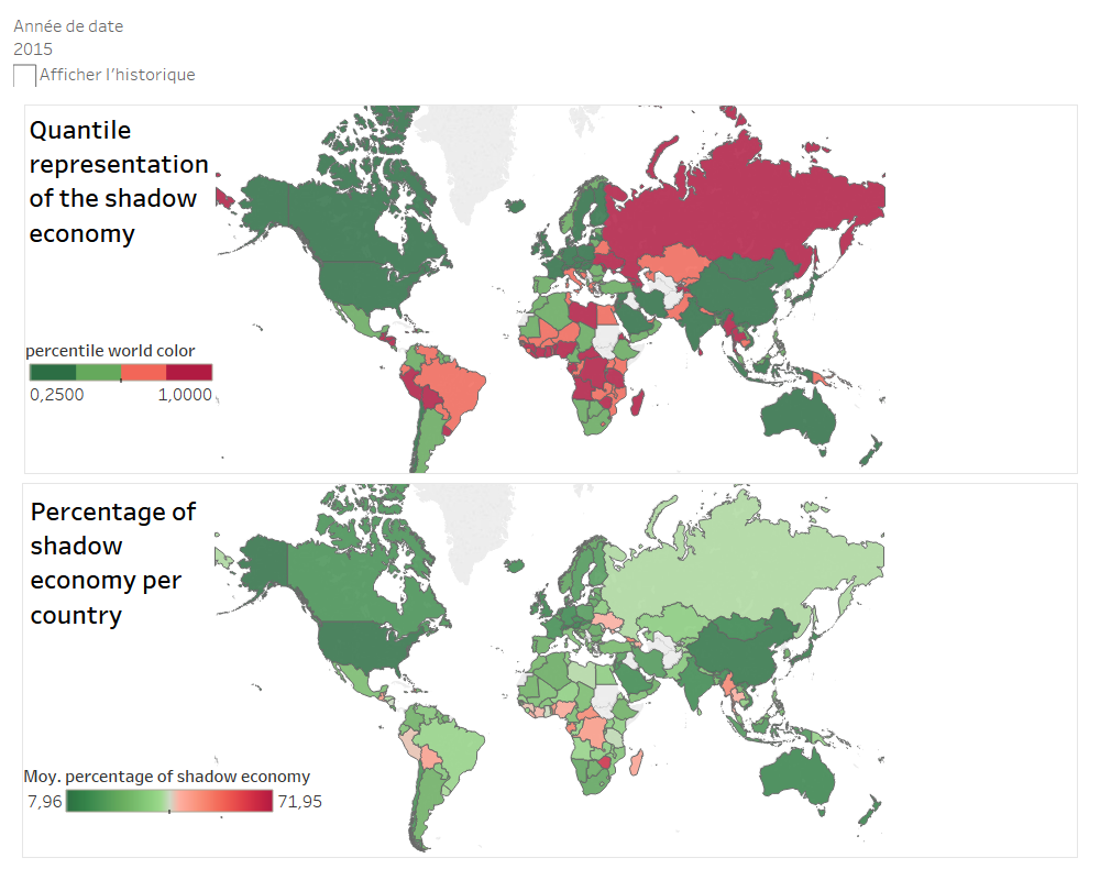
The situation of the shadow economy in 2015
Things look however different after 2008. The above images display the situation in 2008 and 2015. Looking at percentages only you could conclude that the world has got more virtuous. This is actually just due to a few countries like Zimbabwe and Georgia that have high percentage of shadow economies and make all other countries look good in comparison. Things get much easier to understand when you look at the quantile representation in the upper half of the images. Here you see that in fact nothing really changes. The countries the less virtuous remain the same throughout the years.
Advice for your market research (in Belgium, France or elsewhere)
Once you have found the data and build your dataset, go beyond the surface. Don’t fool yourself with misinterpretations.
Scratch the surface and question the results you get. Are they logical? Focus on the one country you’re the most interested in for your market research and compare your visualizations and the resulting interpretations with the raw data.
If you need help to look into your data feel free to drop us a line. We’ll be happy to help.
Credits cover image : courtesy shutterstock
Posted in Research.